IHIS Contract Maintenance Redesign
American Specialty Health
Redesigning a legacy contract management system to streamline internal workflows with how teams actually input contracts.
My Role
UX/Product Design
Timeline
~3 months
Team
PO, engineers, internal stakeholders
Focus
Workflow redesign, interaction design, UI design, prototyping
Overview
Six contract specialists at ASH (American Specialty Health) used IHIS (Integrated Health Internal System) Legacy every single day to translate provider contracts from paper CRFs (Contract Request Forms) into the system. With ASH's Cigna expansion bringing a surge of new contracts, the volume of this work was growing. And the system they relied on was a VB6 application one crash away from losing critical data with no reliable backup. The goal was to migrate contract maintenance into IHIS 2.0 before that happened, and to do it in a way that actually improved how the team worked, not just replicated the old system in a new interface.
The Problem
The legacy system created friction across the entire contract creation process:
Misaligned workflows. Users had to spend unnecessary time jumping between sections.
High cognitive load. Dense, rule-heavy forms required constant context tracking.
Unclear system states. No distinction between view and edit led to confusion and errors.
Low discoverability. Hidden actions required memorization rather than intuition.
Operational risk. No reliable backup system for critical contract data.
Result: Slower workflows, increased errors, and limited scalability
Key Insights & Approach
When I joined the project, I inherited designs started by a previous designer one to two years earlier. After reviewing them alongside the actual CRF-to-IHIS workflow, I realized the existing designs didn't solve the core problem. They replicated the old structure in a new interface without addressing the misalignment between how information arrived on the CRF and how the system required it to be entered. I presented this finding to the product design manager, PO, and lead developer. There was pushback. The team didn't want to redo prior work.
But after reviewing the evidence, leadership signed off on starting from scratch. This decision is what made a genuinely improved workflow possible.
The core issue was not just UI complexity. It was a mismatch between how contracts are structured in CRFs and how IHIS Legacy required users to input them.

What should be a simple transfer became constant translation.
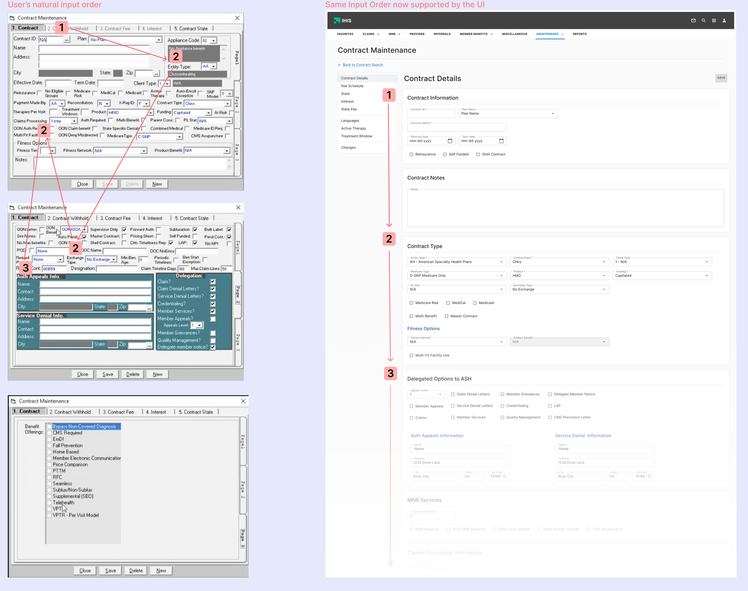
Transforming the Workflow
To address this, I redesigned the core workflow to match how users naturally process contract information.
Before
Fragmented navigation
Constant jumping between sections
Heavy reliance on memory
After
Single, scrollable workflow aligned to CRF order
Clear, linear progression from start to finish
Reduced need for mental translation and context switching
Impact: Faster, more intuitive contract creation for both new and experienced users

Key Design Decisions
1. Introduced a Clear Entry Point
Dedicated page for contract creation and search
Adds a step, but clarifies where to begin
Previously, users would hesitate on where to start. The redesigned entry page makes actions explicit and immediately accessible.

2. Improved System Feedback and Clarity
Clear differentiation between view and edit states
Persistent contract ID visibility
Required field indicators
Validation and confirmation feedback
This increases confidence and reduces errors
System States Clarity

Maintain Contract Context and Form Clarity

Provide Immediate Feedback for User Actions

3. Simplified Complex Rule Configuration
Centralized rule configuration with inputs surfaced at the top and outputs structured below
Integrated related inputs, such as CPT codes, directly into the workflow
Designed clear, scannable layouts for managing dense, rule-based data
Turned a confusing, mixed interface into a clear, structured system that is easier to understand and manage

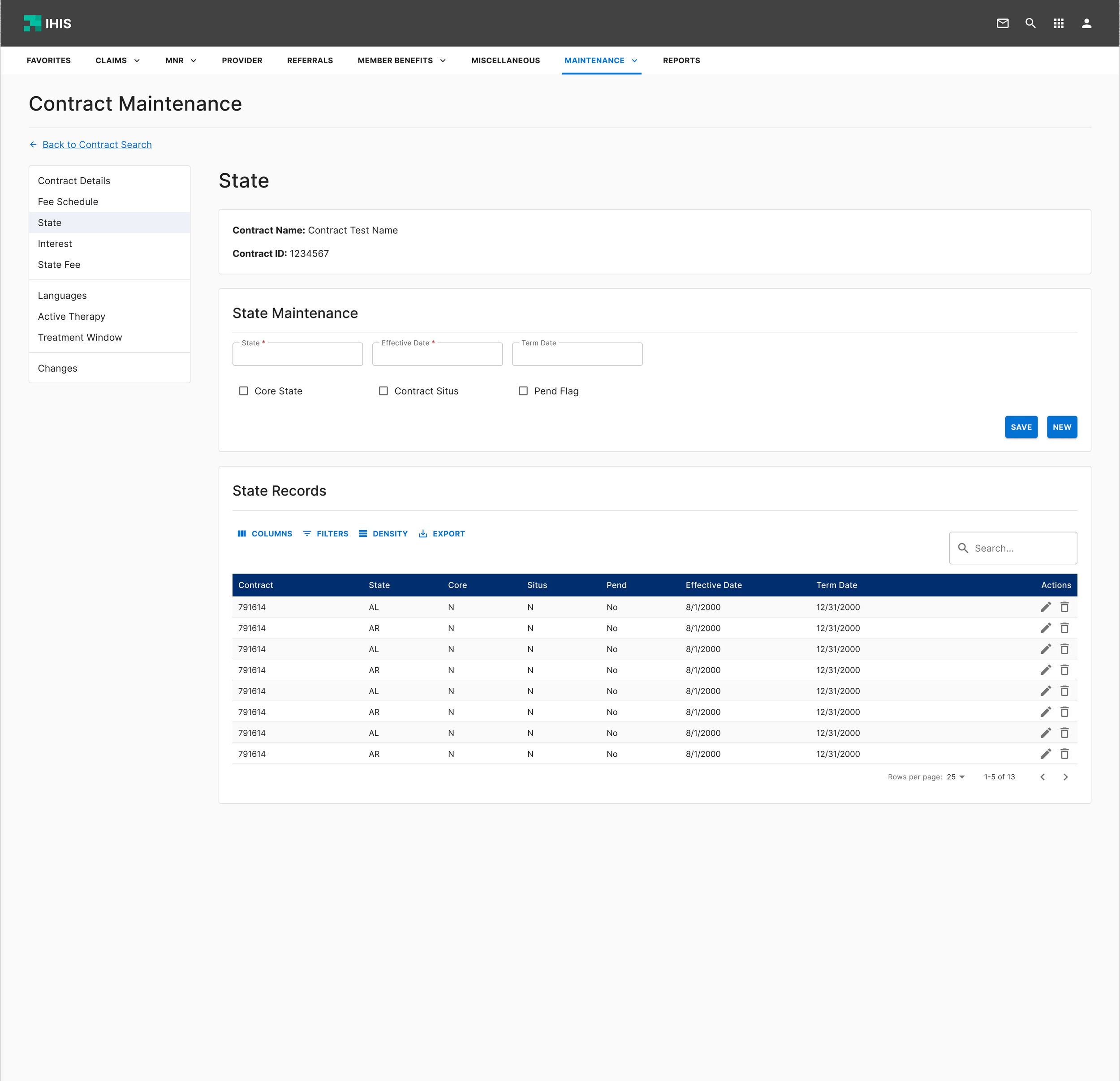
4. Standardized Contract Workflows Across Sections
Standardized layouts across contract sections (fees, states, interest) to reduce variability
Established consistent input patterns and data structures across workflows
Improved hierarchy to make dense contract data easier to scan and compare
This creates a predictable system that scales across contract workflows and reduces the need for relearning
Same structure applied across all contract maintenance sections.

Final Solution
A CRF-aligned, end-to-end contract maintenance workflow supported by:
A single, continuous contract creation flow
Clear system states and feedback
Structured and intuitive data entry
Consistent interaction patterns across all contract components
By aligning the system with how users interpret contract information, the redesign eliminates the need to translate between formats and makes it easier to move from human-readable contracts to structured system data.
Step 1: Create or Search for Contracts

New Contract: Takes user directly into contract workflow

Search: Expands inline to show matching contracts

Introduced a clear entry point with distinct paths for creation and search
Users no longer had to guess where to begin. The redesigned entry page makes primary actions immediately visible and easy to choose between.
Step 2: Main Contract Creation Flow
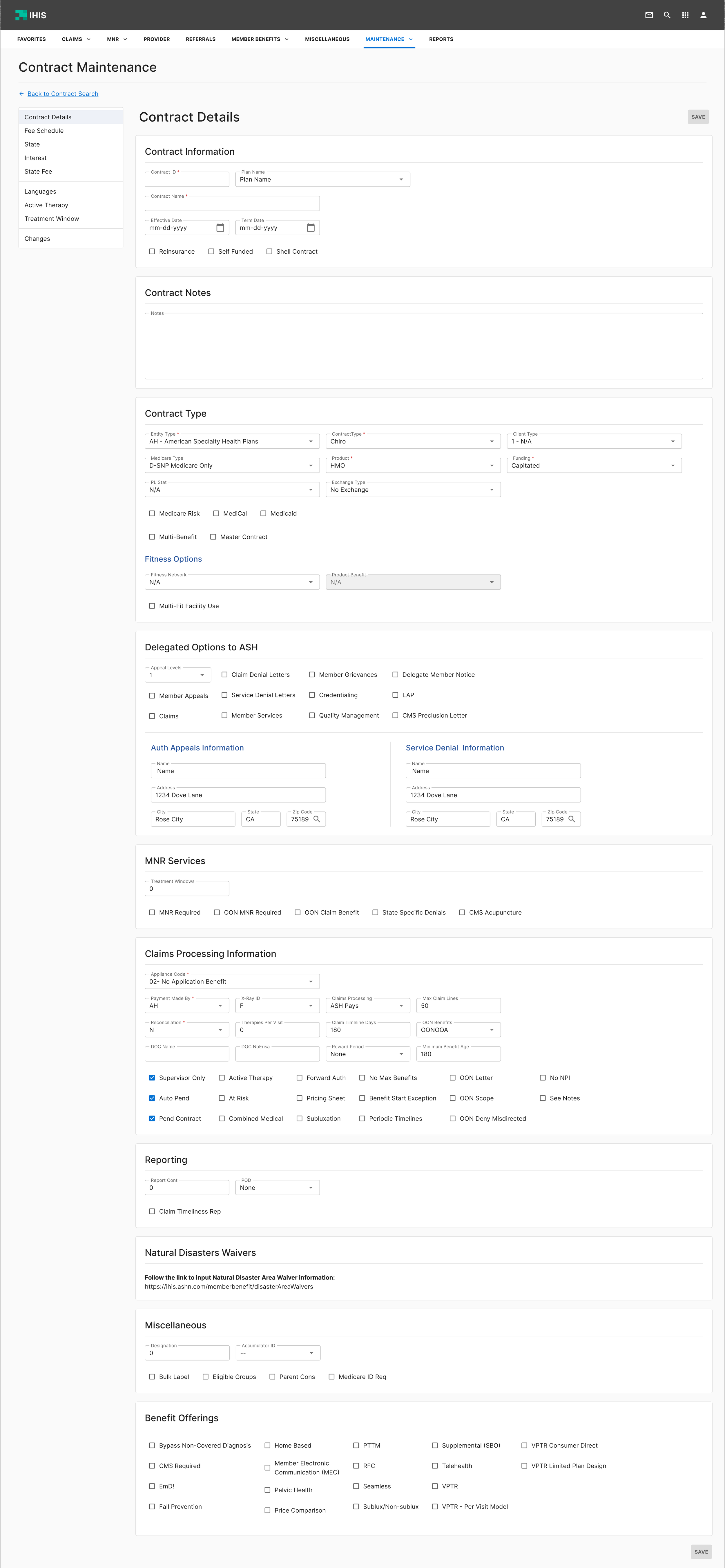
A single scrollable workflow aligned to the CRF
Instead of jumping across tabs and sections, users could move through contract creation in one continuous flow that matched how they received information on the CRF.
Step 3: Supporting Contract Configurations
Treatment Rules
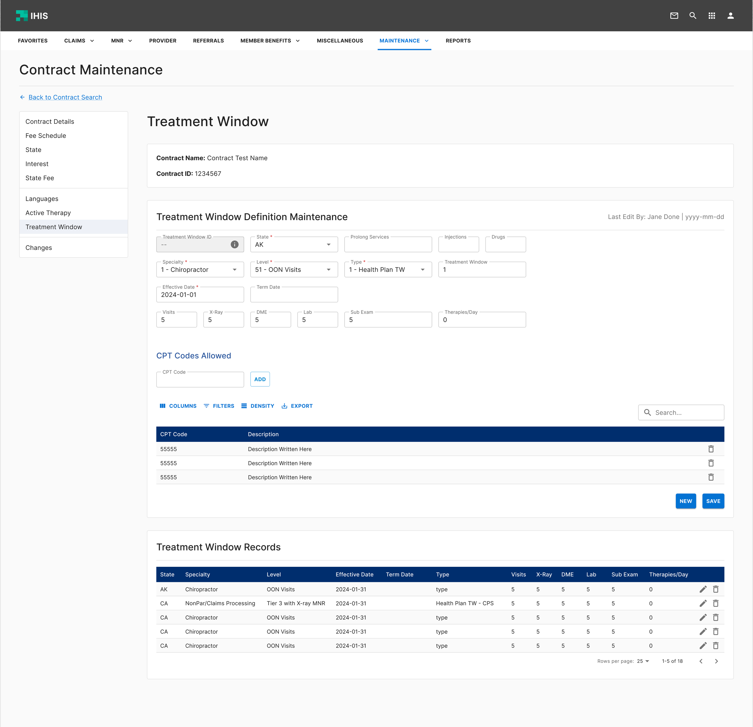
State Rules
Fee Schedules
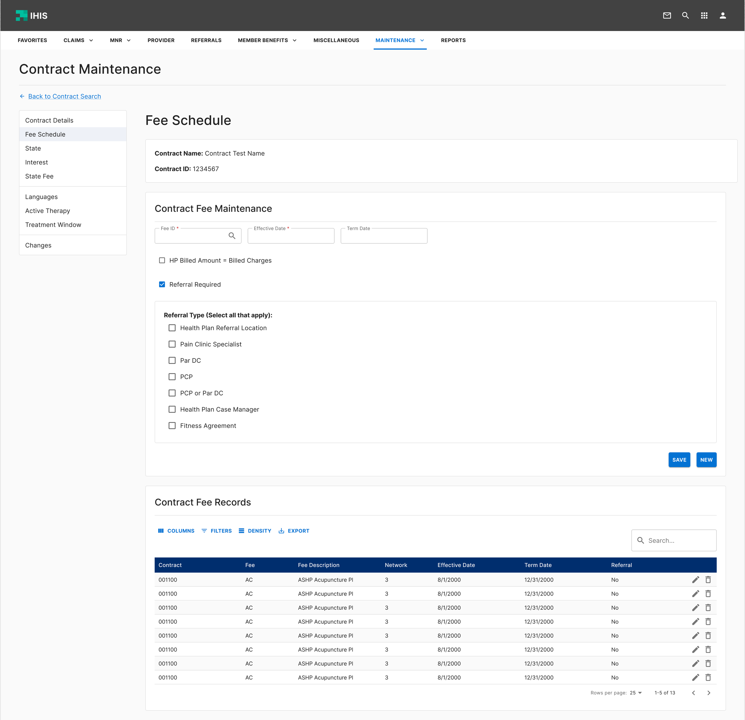
Interest Rules
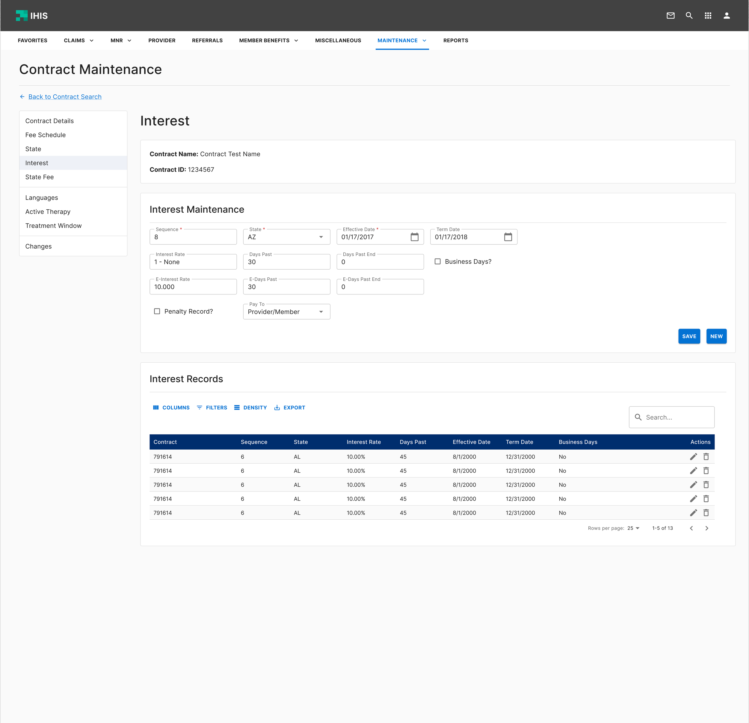
Supporting screens made easier to understand and manage
Secondary workflows were redesigned for better discoverability, clearer system states, and more confident task completion.
Impact
The redesign was fully handed off to development but had not launched before I left ASH. The solution directly addresses the root cause: a mismatch between how contract information is received and how it was required to be entered.
By aligning IHIS 2.0 to the CRF structure, the new workflow eliminates the constant tab-jumping and mental translation that slowed specialists down daily.
To validate impact I would measure time to complete a contract against the legacy system, track error rates during task-based testing, and observe behavioral friction like hesitation and backtracking with first-time users.
Reflection
This project reinforced for me how impactful internal tools can be. Improving them directly improves the day-to-day experience of the people who rely on them.
One challenge was working within existing constraints. The initial ask was to iterate on prior solutions, but deeper research revealed those workflows did not improve efficiency. I advocated for starting from scratch to align the system with real user workflows.
This experience strengthened my approach to grounding design decisions in how people actually work, not how a system assumes they work, and advocating for the users even when it means pushing back. Research is not just about uncovering problems, it is about building the conviction to solve them the right way.